Hyphenova Design System
Building accessible systems for brand–creator platforms with mobile-first consistency and scalable design ops.
A token-based, WCAG-compliant design system that unified styles, improved mobile-first design consistency, and reduced friction between design and development. It enabled faster prototyping, streamlined documentation, and scalable components across a dual-facing collaboration platform used by brands, creators, and sponsorship managers. The result: 30% faster prototyping and 50% fewer handoff issues.
Timeline
16 weeks
Role
Design Systems Lead
Year
2023
Project Overview
Where It Started
Hyphenova was a dual-facing platform connecting brands and creators, built on a no-code stack. This approach, while fast, led to significant design inconsistencies and a fragmented user experience.
What I Noticed
Through heuristic evaluations and design audits, I identified critical issues: inconsistent spacing, undefined component states, and a complete lack of design tokens, hindering scalability and brand cohesion.
My Proposal
I proposed building a comprehensive, token-based design system to unify the platform's visual language, streamline design-to-development handoffs, and ensure WCAG compliance for a scalable and accessible future.
Usability Audit Summary
A comprehensive usability audit was conducted across the Hyphenova platform to systematically identify recurring usability issues and inconsistencies within the existing design. This detailed evaluation helped pinpoint critical areas for improvement, laying the groundwork for a more cohesive and user-friendly experience.
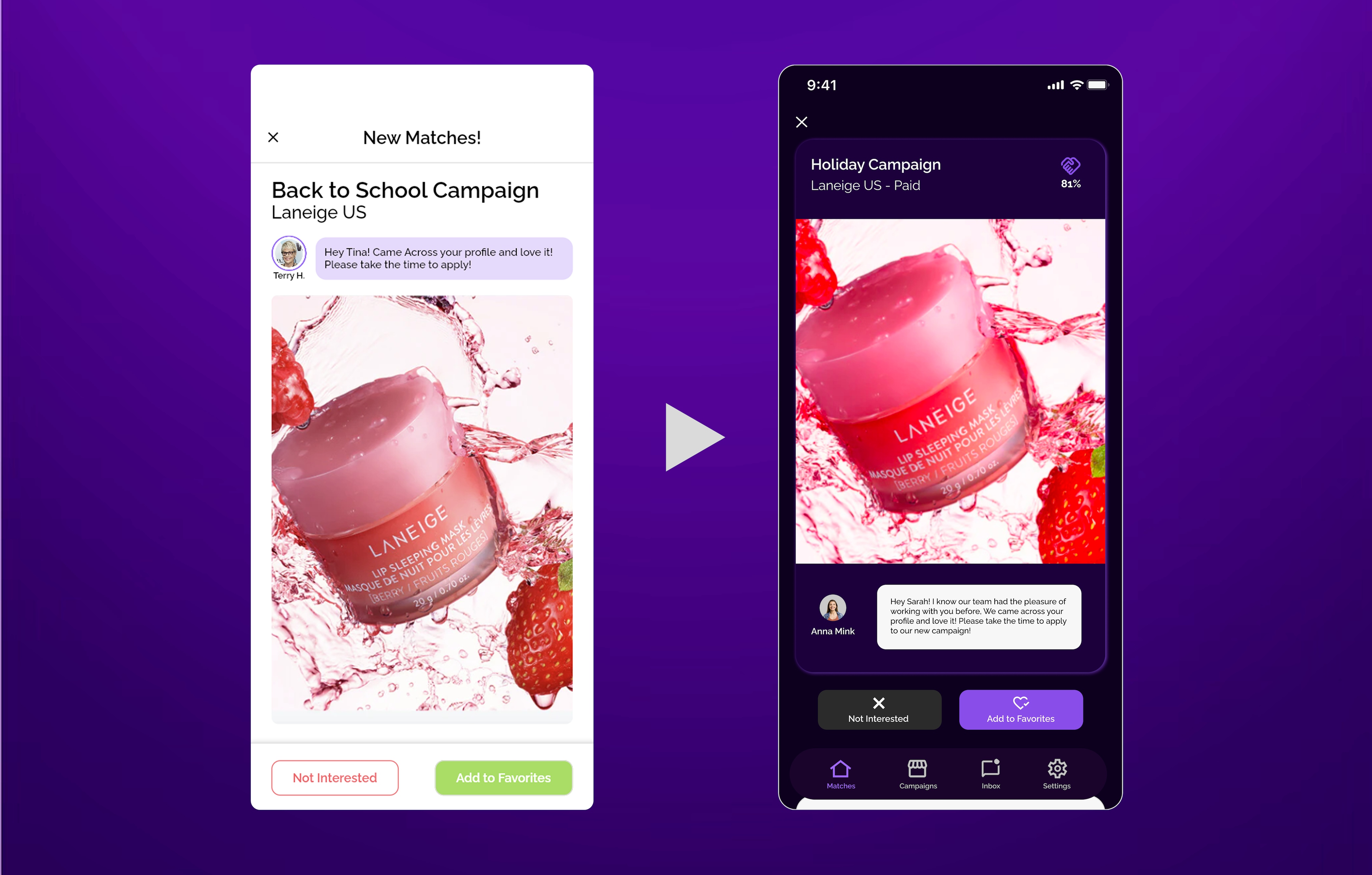
An example of the Matches homepage screen showcasing key usability issues identified during the audit.
Cluttered UI & Cognitive Overload
Excessive visual elements (badges, tags, icons, text) in profile cards made information scanning difficult, leading to cognitive overload.
Recommendation: Prioritize essential information, group related elements, and introduce better spacing to reduce visual clutter.
Weak Affordance for Primary Actions
The "Reject" & "Invite" buttons lacked strong visual differentiation, making it unclear which action was primary.
Recommendation: Enhance visual hierarchy by making the primary action more prominent while subduing the secondary action.
Fragmented Visual Language
Disparate use of typography, color palettes, and UI elements led to a fragmented and unprofessional appearance across different sections.
Recommendation: Establish a unified visual language with standardized components and consistent styling.
Handoff & Documentation Challenges
Limited guidelines and documentation created ambiguity for designers and developers, leading to frequent misinterpretations and inefficient handoff processes.
Recommendation: Create comprehensive, centralized documentation with interactive examples and clear guidelines.
From Audit to Action: The Design System Imperative
Based on the critical findings from the usability audit, particularly the pervasive visual inconsistencies, inefficient component management, and significant handoff challenges, it became clear that a piecemeal approach would not suffice. The recurring issues highlighted a fundamental lack of a unified design foundation. Therefore, the comprehensive recommendations derived from this audit directly informed and solidified the decision to embark on building a robust, accessible, and scalable design system. This strategic shift was essential to address the root causes of the identified pain points and pave the way for a more efficient, consistent, and user-friendly product development lifecycle.
My Process
A structured approach to design system development.
Primary Inspiration
I primarily drew inspiration from GE's Ethos Design System for its emphasis on scalability, accessibility, and structured UI components. I also studied Google's Material Design, Apple HIG, and IBM Carbon to incorporate industry-leading UI/UX practices.
Defining Breakpoints
I established multi-device breakpoints to ensure scalability: Mobile (up to 480px), Tablet (481px – 1024px), Desktop (1025px – 1440px), and TV/Large Screens (1920px+). The design system was initially developed with mobile as the primary focus.
Design Audit & Standardization
I audited FlutterFlow screens and components, documented recurring patterns for standardization, and structured UI elements into atoms, molecules, and organisms for hierarchy and reusability.
Focus on Cards & Autolayouting
This project's UI is centered around card components, with Auto Layout enabling quick adaptation to evolving requirements, ensuring seamless resizing, rearrangement, and consistency.
Ensured Accessibility & Contrast
Followed WCAG guidelines for readability and usability in both light and dark modes.
Customized for Brand & Scalability
Refined colors, developed reusable components, and implemented a flexible grid system (4-column for mobile, 8-column for tablets, 12-column for desktops), optimizing development time by 30%.
Design System Foundation
Building blocks for consistent experiences.
Design Tokens
Established a comprehensive token system covering colors, typography, spacing, and motion. Tokens were platform-agnostic and automatically synced between Figma and code repositories.
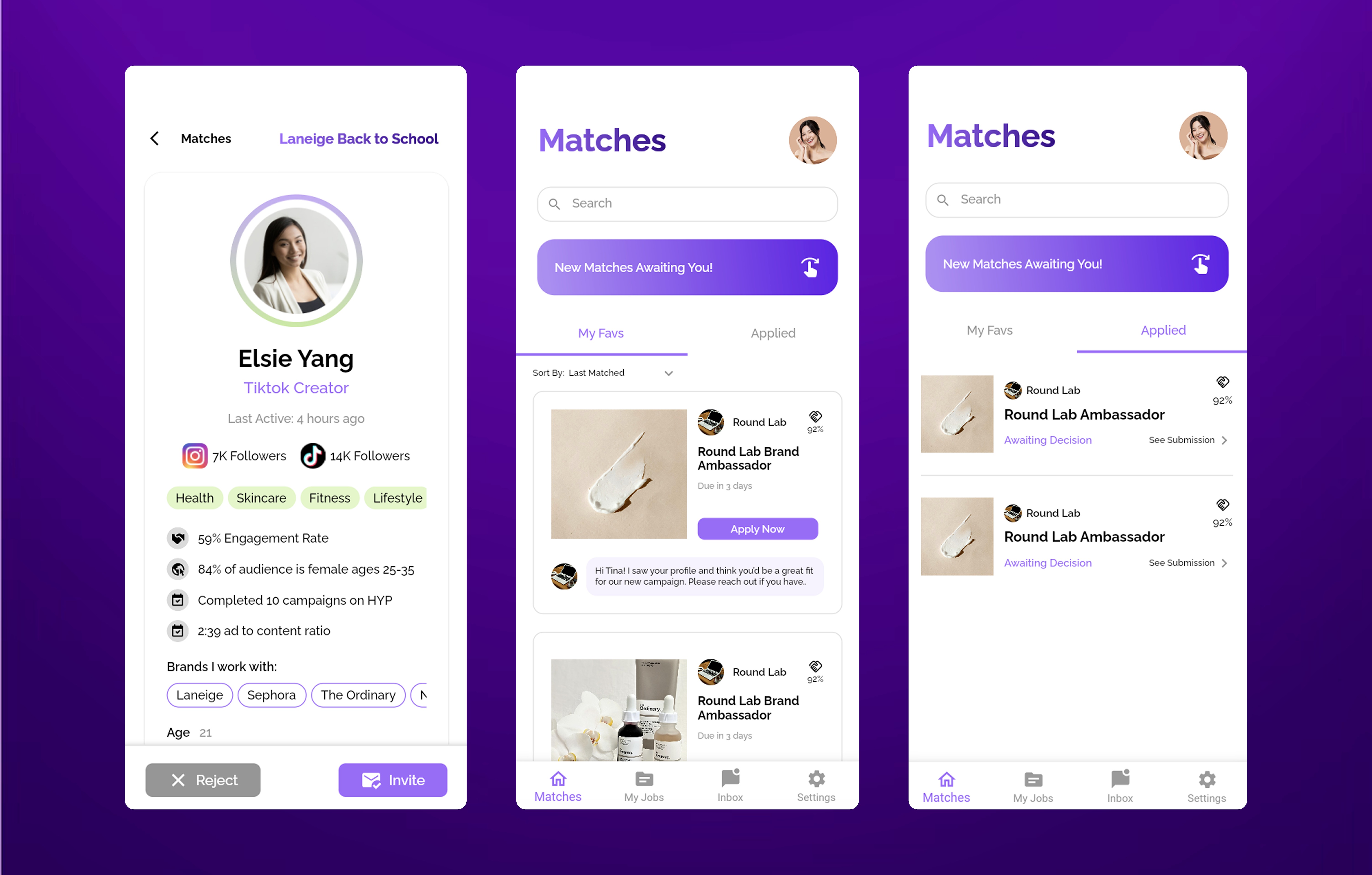
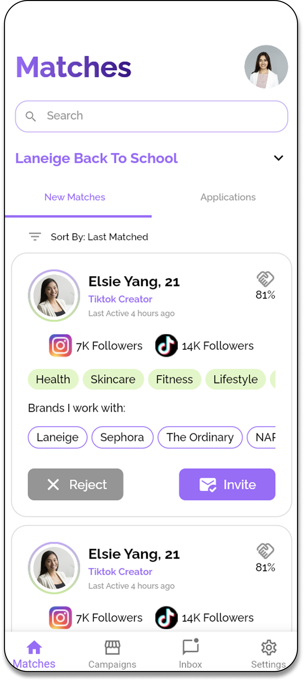
Component Library
Built 50+ reusable components with variants for different contexts. Each component included accessibility guidelines, usage examples, and responsive behavior documentation.
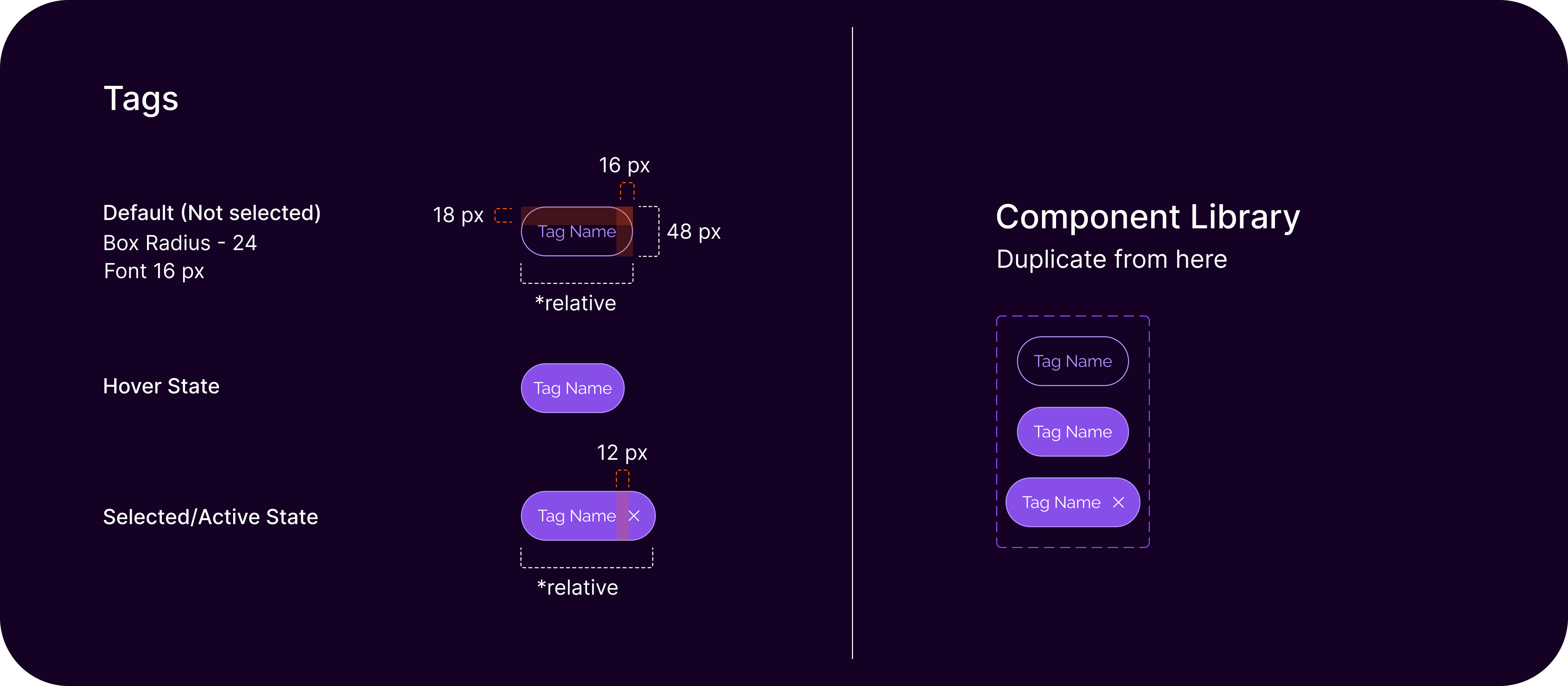
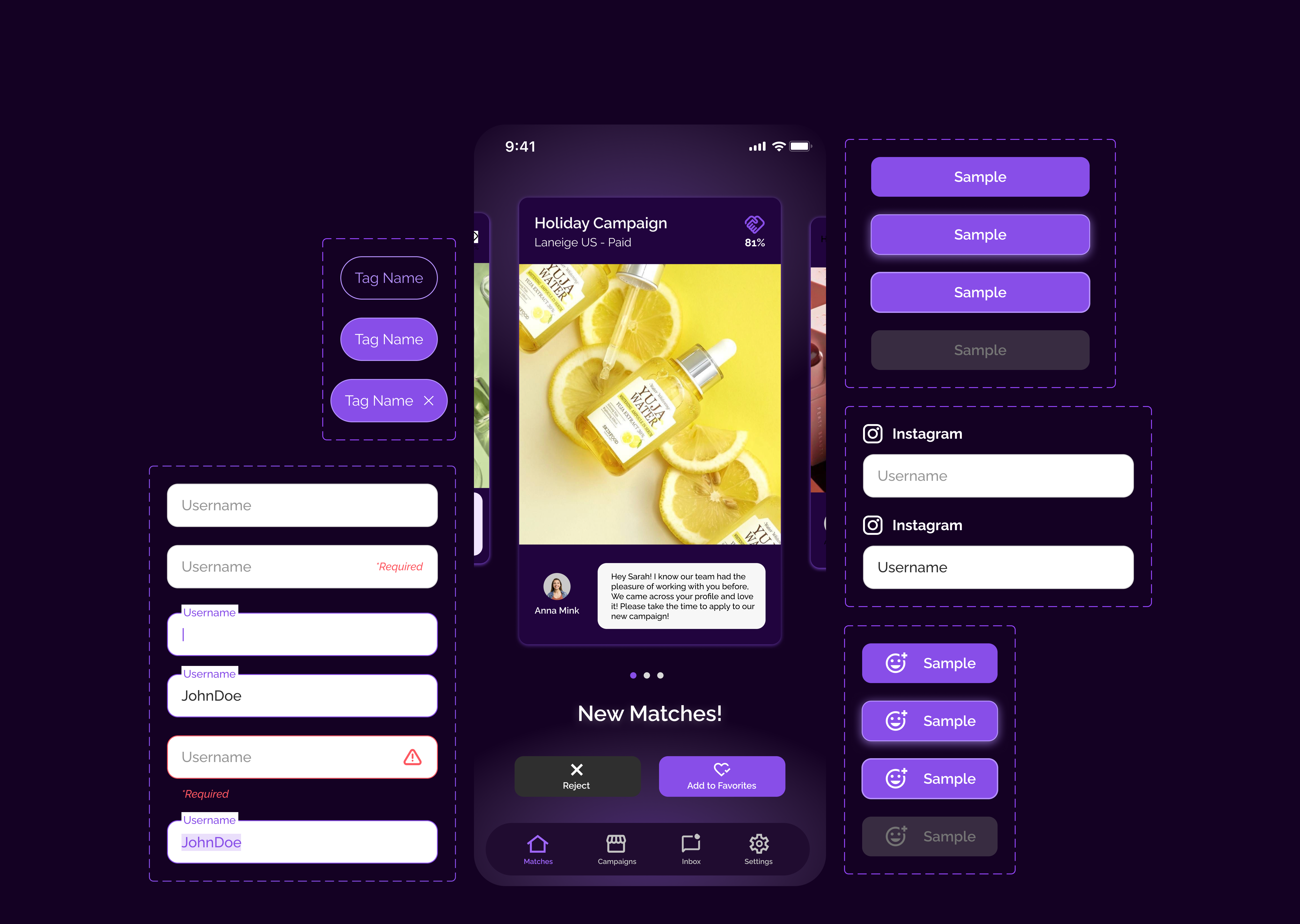
Tag Components
Standardized tag system with consistent spacing, states, and interaction patterns. Includes default, hover, and selected states with precise measurements and reusable component library integration.
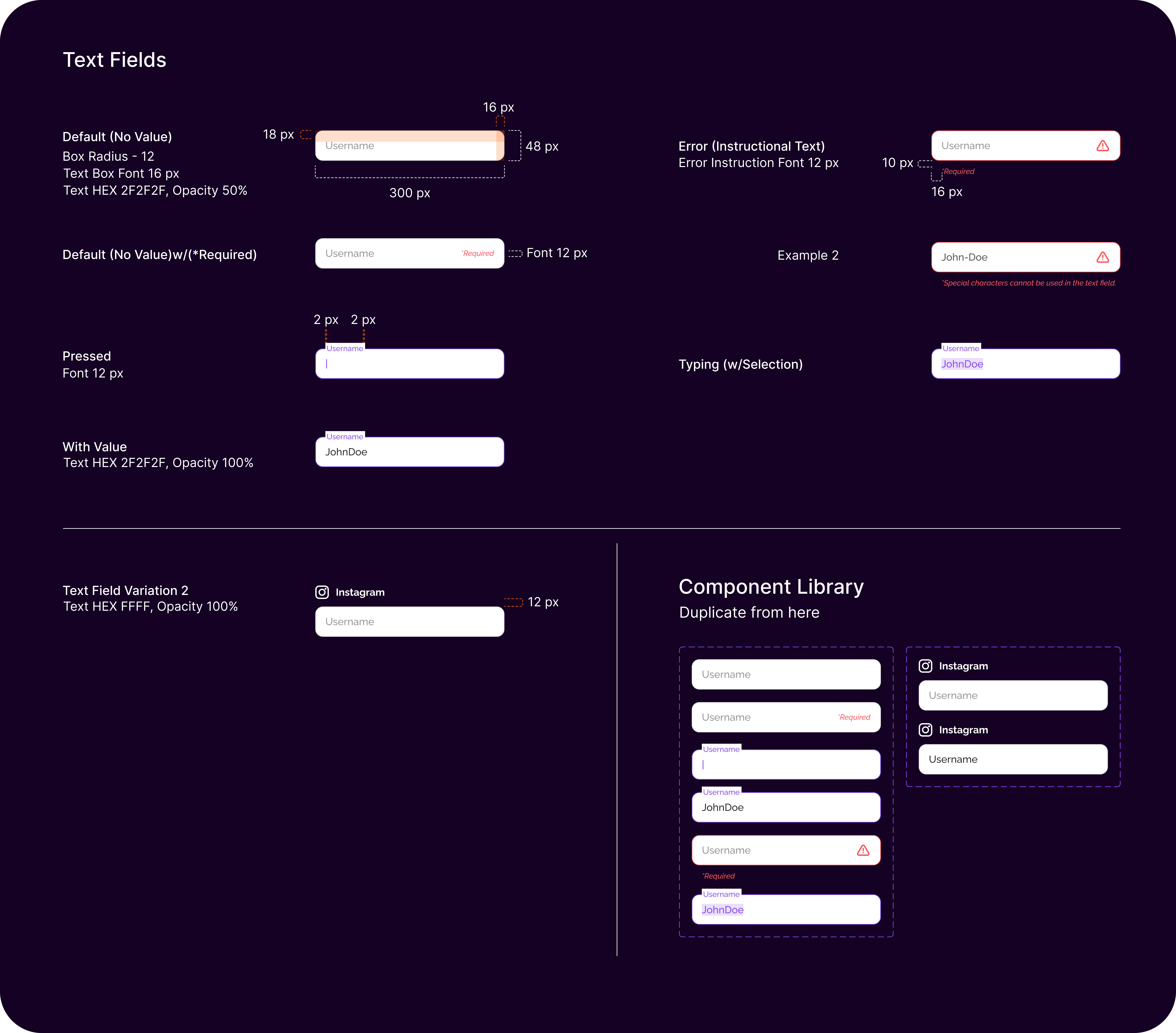
Input Field System
Comprehensive text field components covering all interaction states including default, error, focus, and validation. Features consistent styling with detailed specifications for various input types.
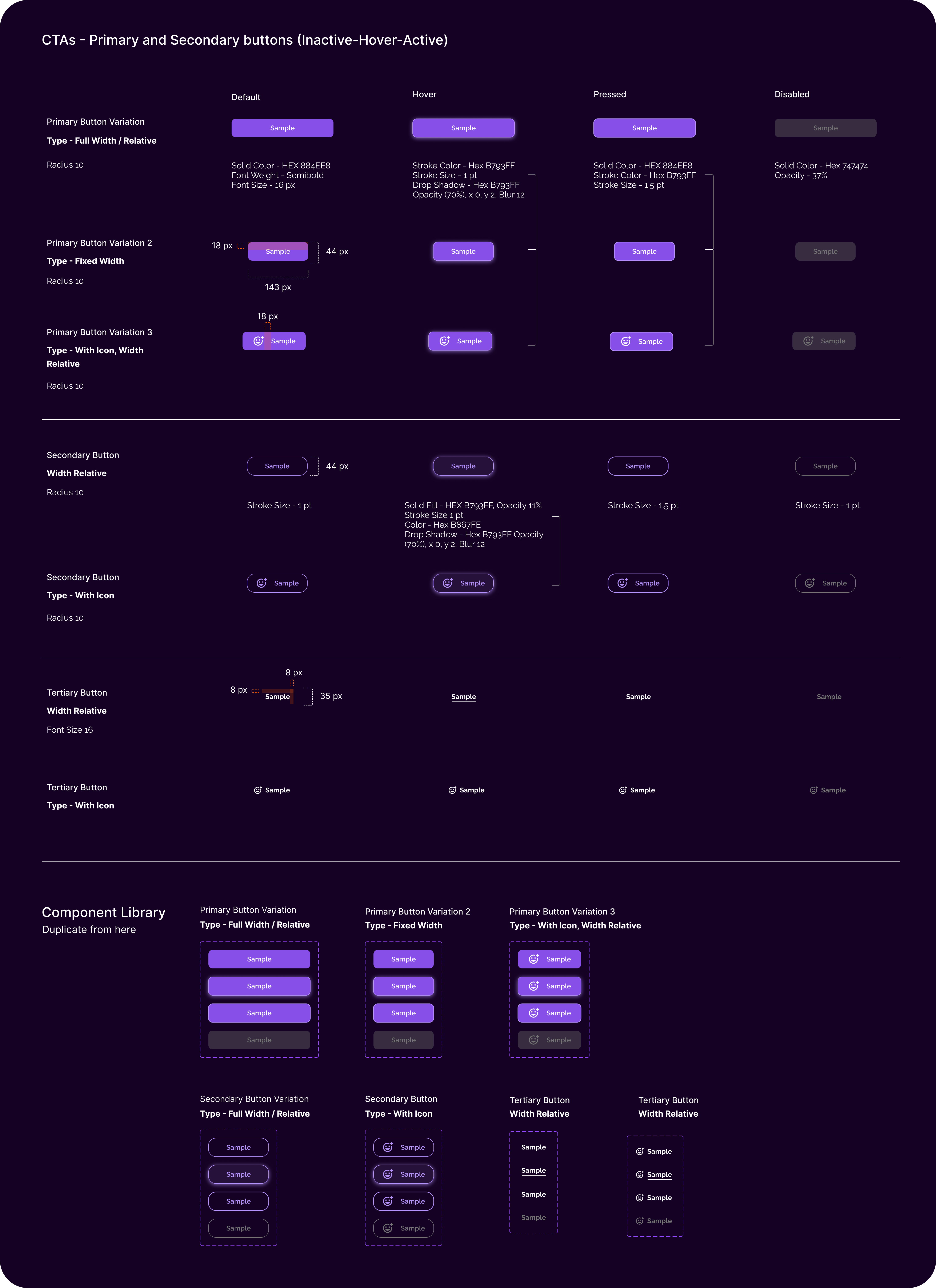
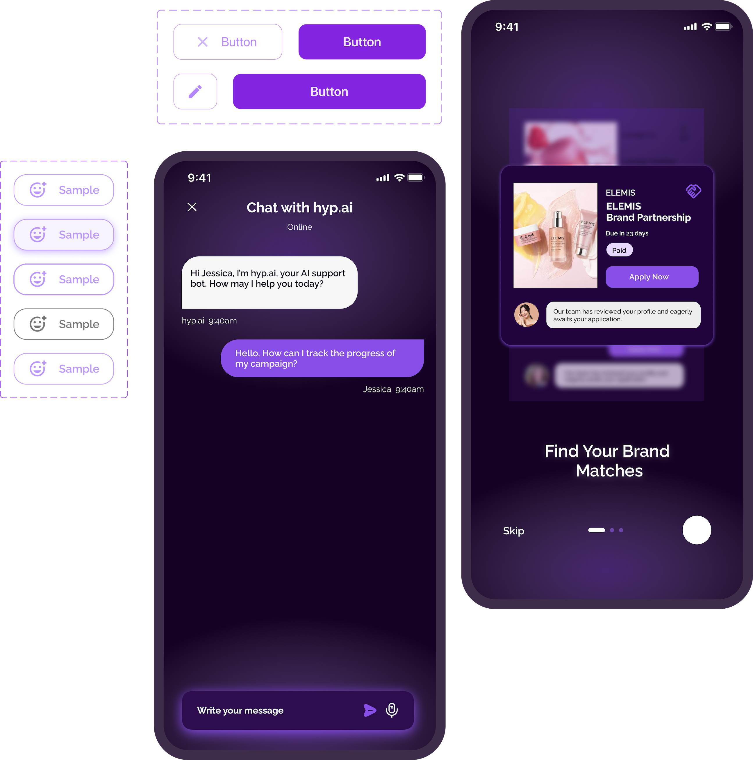
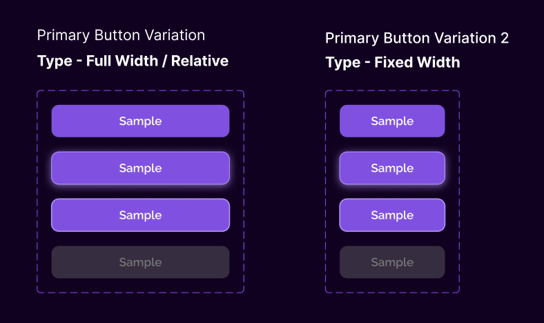
Button Hierarchy
Complete CTA system with primary, secondary, and tertiary button variations. Each button type includes all interaction states with precise measurements and accessibility considerations.
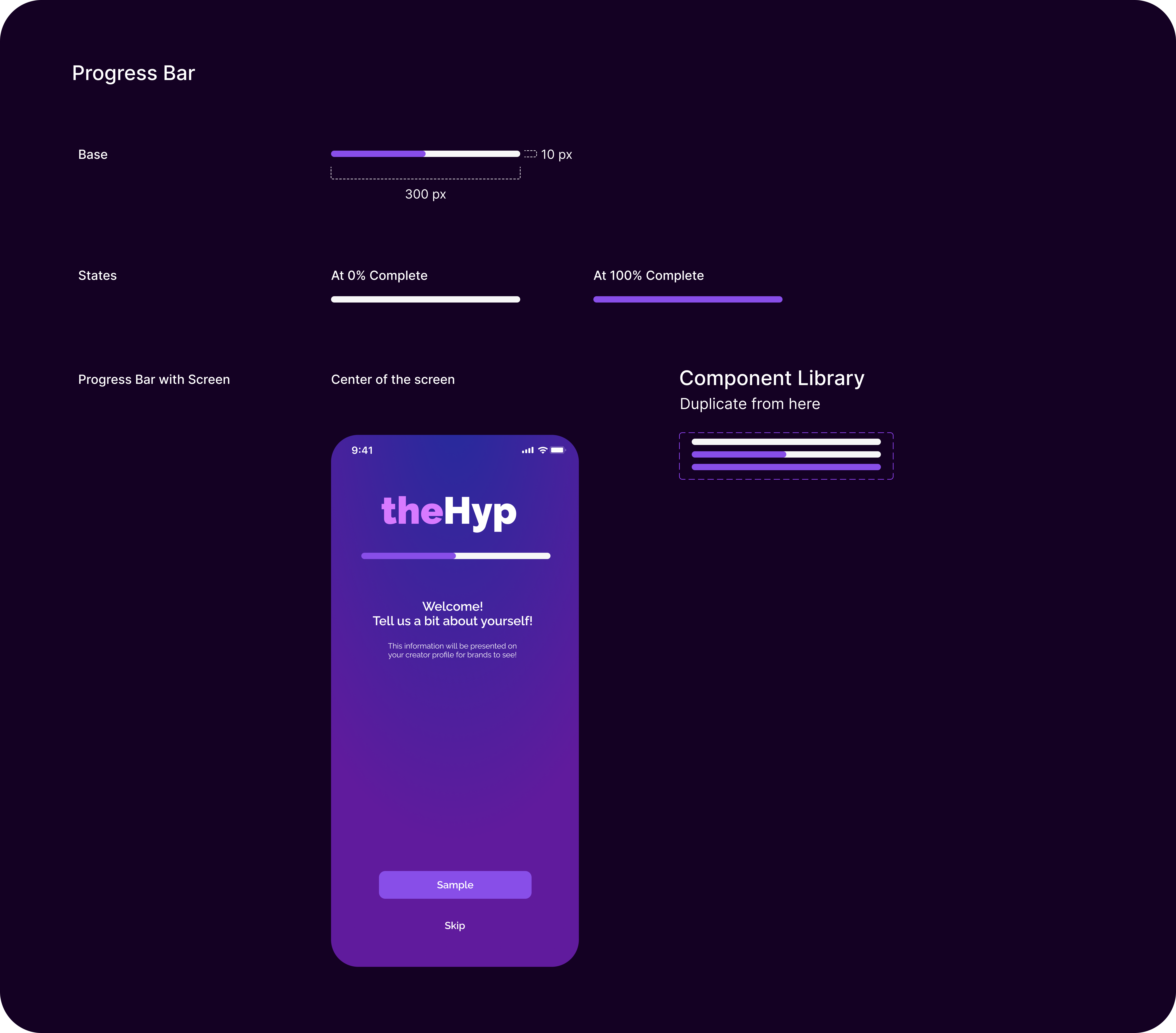
Progress Indicators
Progress bar components with consistent styling and behavior patterns. Includes base specifications, completion states, and contextual implementation examples within the app interface.
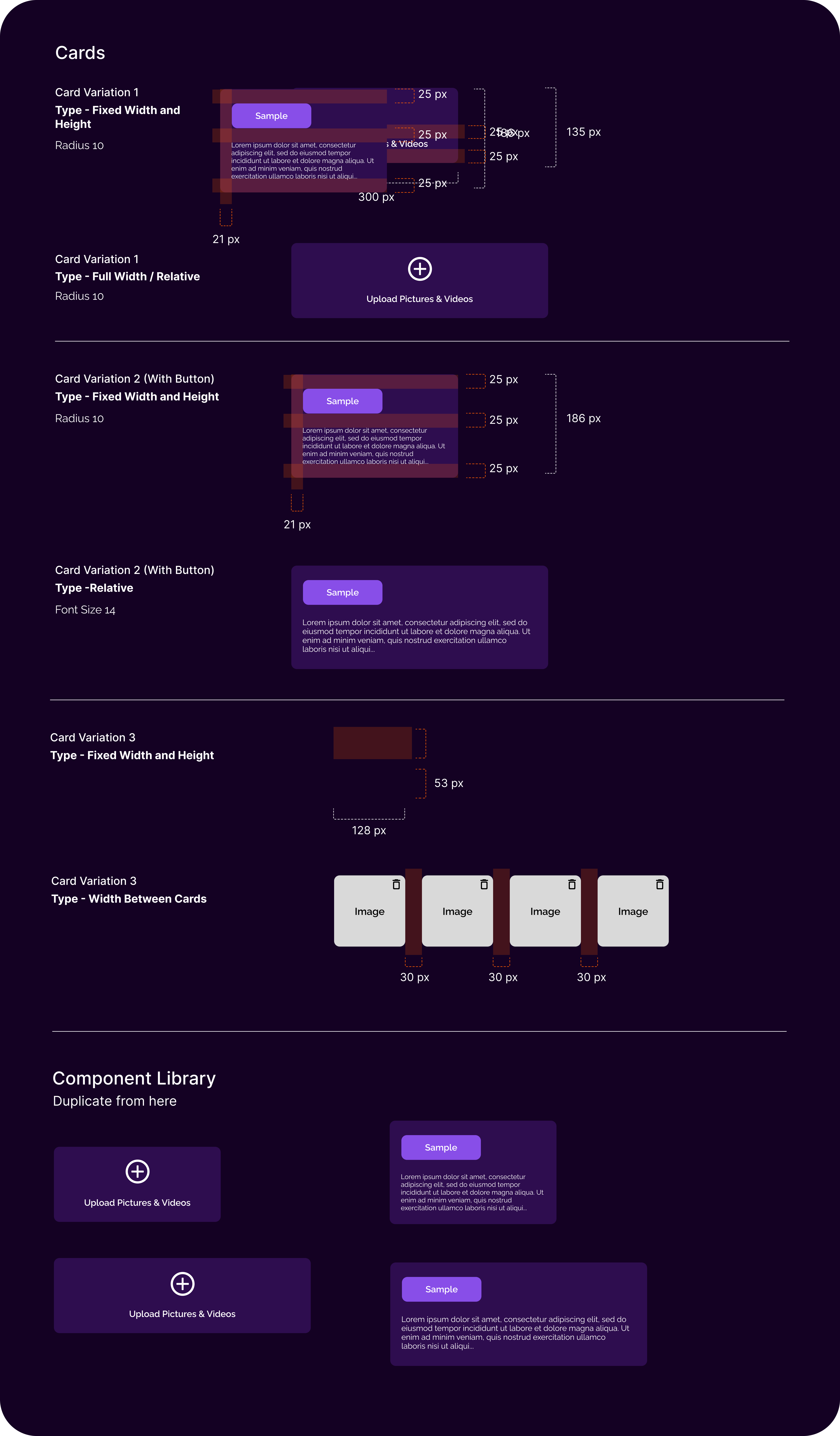
Card Variations
Flexible card system with multiple layout options including fixed dimensions, relative sizing, and interactive elements. Features consistent spacing, radius, and content organization patterns.
Specifications and Guidelines Examples
Detailed implementation guidelines ensuring consistent component usage across all platforms and contexts.
Button Width
Button width is variable based on the length of label (with or without an icon) with the following guidelines:
- •Regardless of how few characters are used in the button label, minimum button width is 96px.
- •Button width scales with the length of the button label, retaining a consistent 24px padding with the vertical boundaries of the button.
- •When buttons are used in combination (for example, submit, reset), the buttons should be the same size, with the width of each dictated by that of the longest label used.
- •The exception to the previous is in the use case of the full-width action button.
Position and Order
In general, action buttons should be positioned directly below and/or to the right of the fields, data, or content displayed in the UI that they directly impact. When used in combination, the primary action button should be positioned furthest to the right with successive positioning to the left in order of hierarchy (secondary, then tertiary).
Accessibility & Mobile-First Design
Inclusive design at the core.
WCAG AA Compliance
Every component met WCAG 2.1 AA standards with proper color contrast, keyboard navigation, and screen reader support. Automated testing ensured ongoing compliance.
Mobile-First Approach
Components were designed mobile-first with progressive enhancement for larger screens. Touch targets, gesture support, and performance optimization were built-in.
Inclusive Design
Considered diverse user needs including motor impairments, cognitive differences, and varying technical literacy. Components adapted to user preferences and assistive technologies.
Team Collaboration & Adoption
Scaling design across teams.
Adoption Strategy
Documentation & Training
Created comprehensive documentation with interactive examples and conducted training sessions for design and development teams.
Gradual Migration
Implemented a phased approach, starting with new features and gradually updating existing components to maintain system consistency.
Feedback Loop
Established regular feedback sessions and contribution guidelines to ensure the system evolved with team needs and product requirements.
Impact Metrics
Key Learnings
Insights from building at scale.
Building a design system is as much about people and processes as it is about components and tokens. Success came from treating it as a product with its own users and needs.
Start with Foundations
Investing time in solid foundations-tokens, principles, and governance-paid dividends later. Teams could move faster because the underlying system was robust and well-documented.
Adoption is Everything
The best design system is useless if teams don't adopt it. Success required ongoing evangelism, training, and making the system genuinely easier to use than building from scratch.
Accessibility as a Feature
Building accessibility into the system from day one made it a natural part of the design process rather than an afterthought. It became a competitive advantage and source of pride for the team.